Designed to Sell: Post House with Tamara & Noah
Workshop/APD’s partnerships with NYC real estate developers present unique and exciting opportunities to explore and create contextually relevant architecture and design in our own backyard. Working with Tamara Abir and Noah Plener from The T + N Team at Compass on Post House Brooklyn checked all the boxes for an ideal collaboration – a sibling duo with an unerring eye for design, an intimate knowledge of Brooklyn, and an urban development with a special history just blocks from the design team’s own homes.
We sat down with Tamara and Noah to discuss the project’s breakaway success, with all but one unit has sold in the year since it first came onto the market. Launching sales in spring of 2022 and achieving 95% sellout by spring of 2023, Post House was one of the fastest selling buildings this year in Brooklyn, and garnered the highest price per square foot ever achieved in this location.

Ellie: Could you begin by telling us a little bit about yourselves and your backgrounds in real estate?
Tamara: I originally came to New York as a voice actor, and for a long time I had a voiceover career, but I turned to real estate because I wanted to be the master of my own destiny. I wanted to make things happen instead of waiting for phones to ring. Noah was also an actor, and I convinced him to join me because I knew he would do well in real estate. We joined a new development team at Halstead,the top developers in Brooklyn, for about three years and we learned a lot from them. About five years ago, we joined Compass, where we now we have six agents & assistants, building our niche in new development consulting in Brooklyn.
E: How long have you been working on Post House, specifically?
T: We started about three years ago, working closely with the Workshop/APD team from the very beginningto help determine the mix of unit types, the amenity package, and of course, the design, based on what we believed would do well in the market.
E: How did the team choose everything that would be included and how it would all go together?
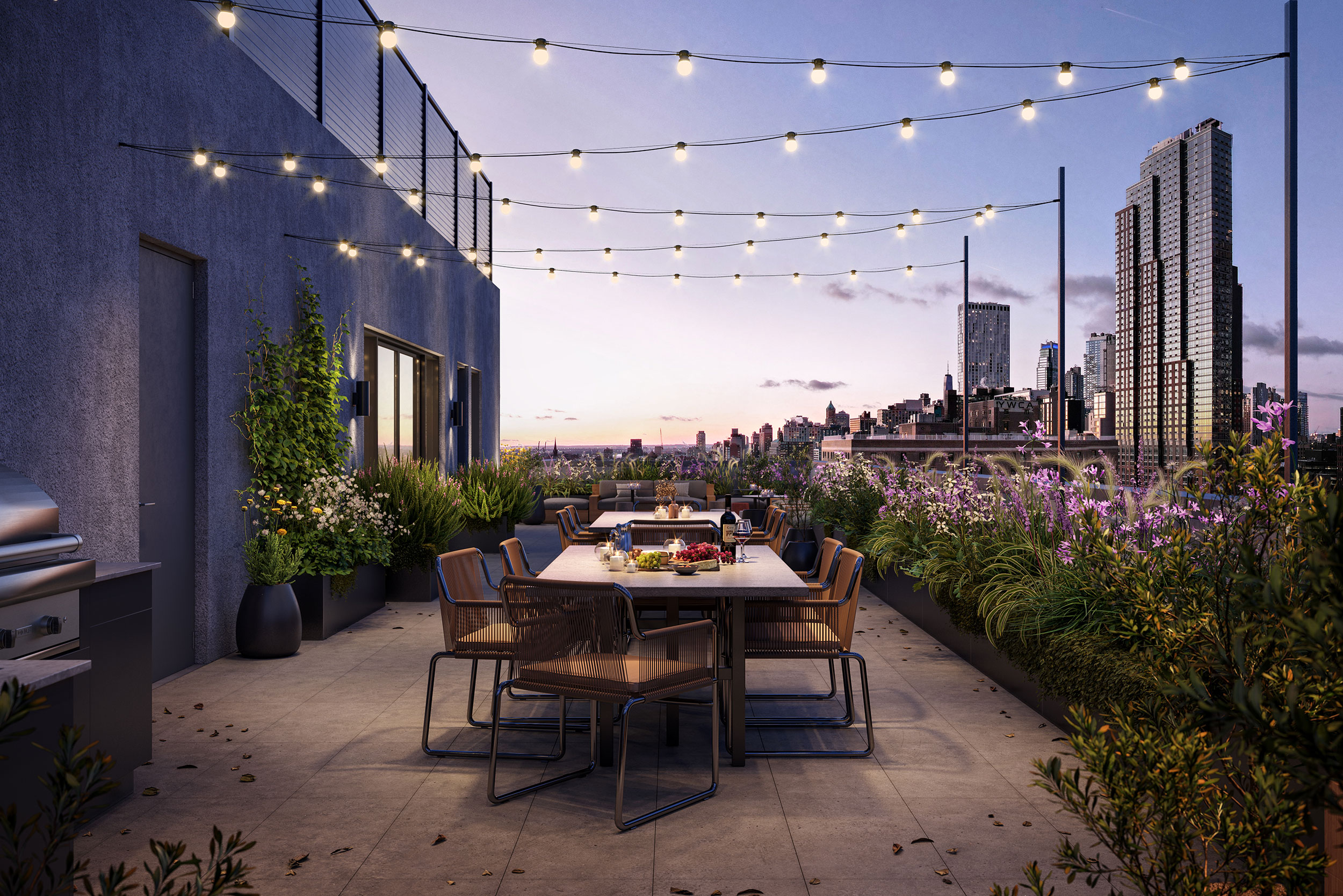
T: We began work at the beginning of the pandemic, and it was difficult to imagine what things would be like post-Covid. We adjusted the amenity package with that in mind, putting outdoor fitness on the roof in addition to the gym space. We added some elements that we thought would be appealing to families – a larger kid’s playroom, as well as storage space, a residents’ lounge and a craft studio – all designed for the times we’re living in now.

E: What excites potential buyers the most when they visit the property?
N: We really enjoy experiencing visitors’ reactions to the tunnel entrance in the courtyard. When entering from Pacific, a brownstone block, it was a very surprising experience to come through this large, arched tunnel entrance into a lush courtyard. The tower is set back from the street, is a rare thing in Brooklyn. You’re in a busy corridor adjacent to 4th Avenue, the Barclays Center, and a busy transit hub, and then you enter a courtyard that feels like a secret garden in a bustling part of Brooklyn.
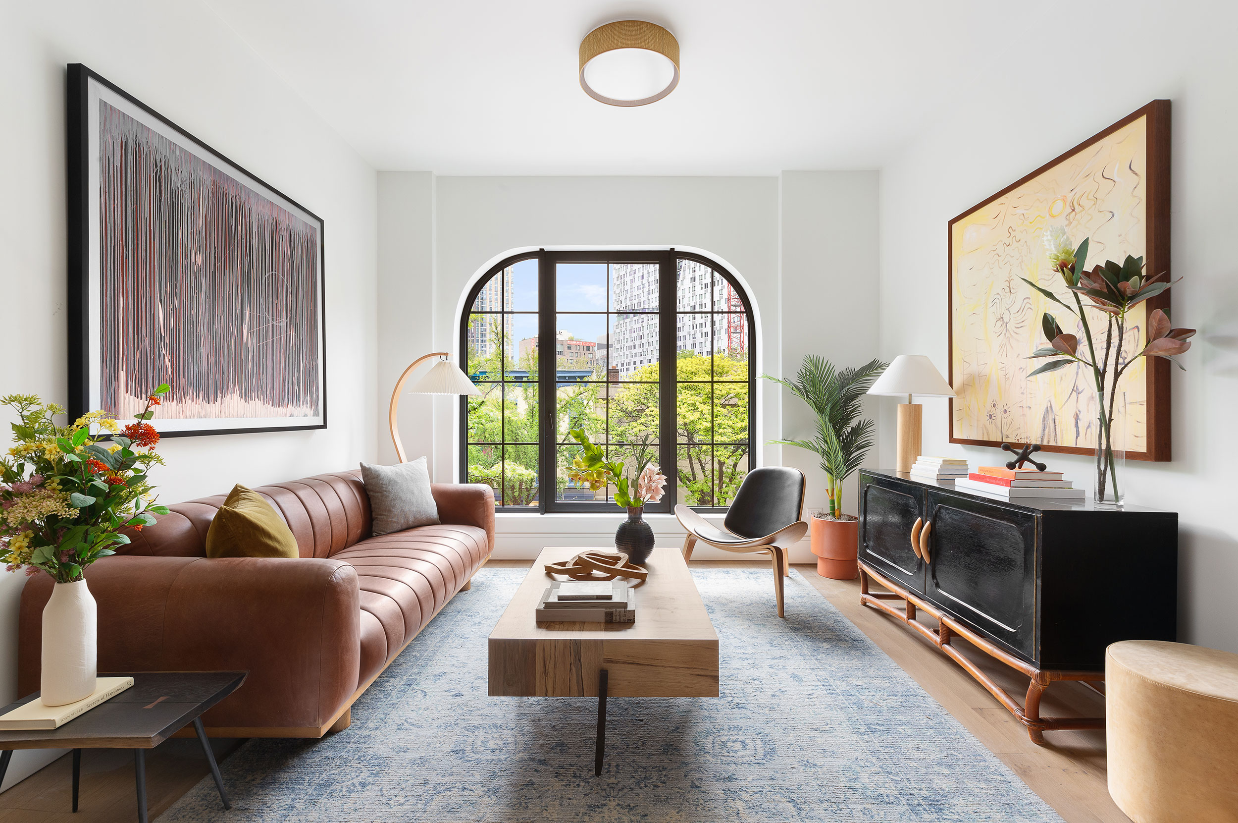
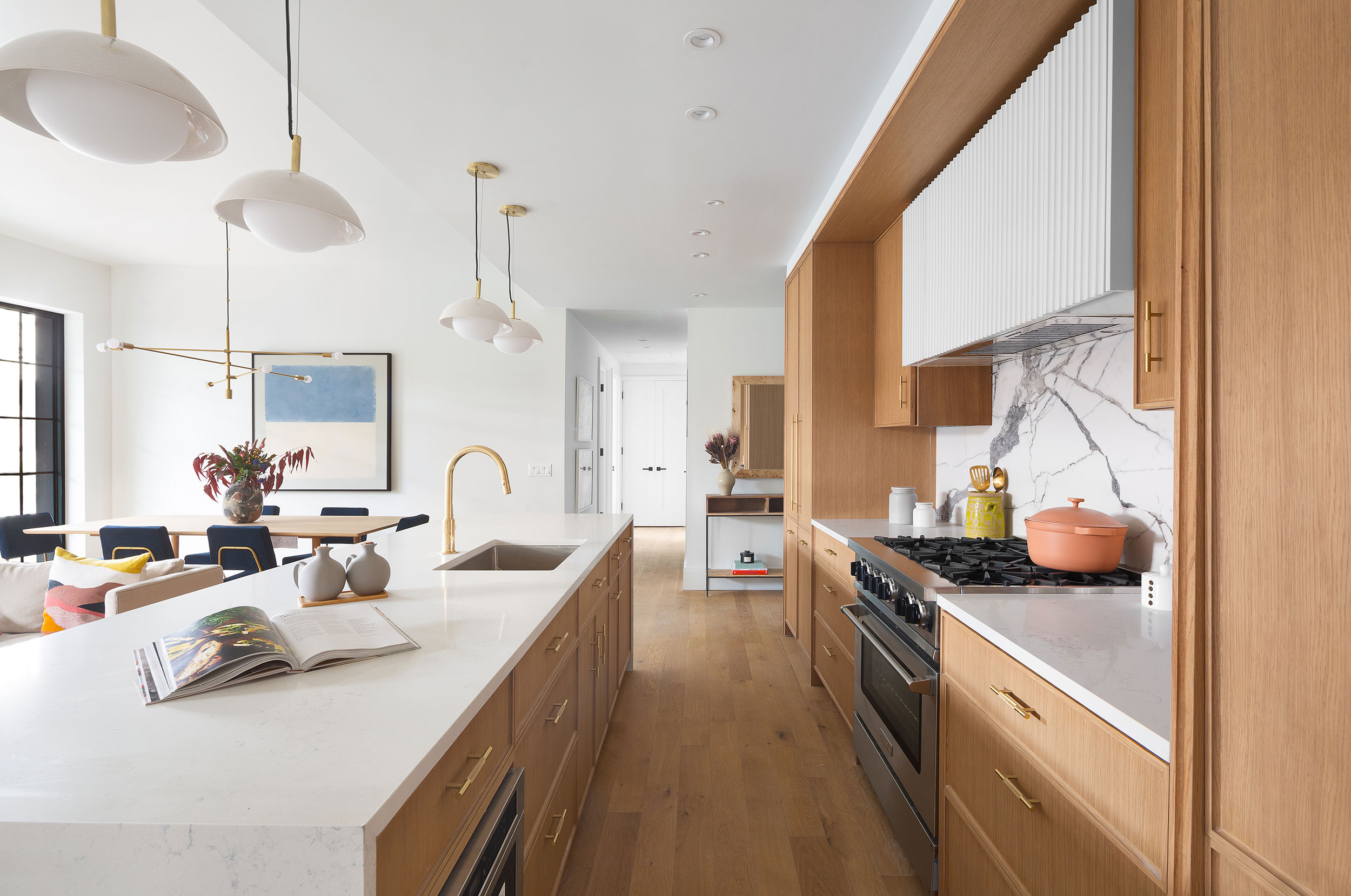
T: Buyers also enjoyed seeing the arched motif inspired by the original post Office’s keystone. The design team brought the arches into the lobby, hallways, and light fixtures, the windows in the façade, the millwork in the kitchen, and the cladding on the hood. That’s been the biggest differentiator design-wise. It doesn’t feel as cookie cutter as some other projects. We’ve gotten comments that this is the best-designed condo in Brooklyn.
E: How did you initially launch sales of Post House?
N: We started with a soft launch, working with a few top brokers and posting on social media. Once we staged the model unit, we shot photos and put a public listing on all platforms.

E: What do people come to Post House looking for?
T: Buyers are looking for really livable, beautiful, functional spaces, and Post House offered something design-wise that was more interesting than other projects in Brooklyn. Between the beautiful layouts, a nice amenity package, and a building size that’s really appealing – it’s big enough to be a doorman building but still a community building – and the location, it really appealed to young professionals and families alike.
N: I think a lot of buyers are moving to Brooklyn for a little less density, more of a neighborhood feeling, and this was built within the context of a real brownstone neighborhood. It’s not a 400-unit tower. There’s a nice variety of units but a smaller community feeling.
E: What are each of your favorite design elements?
T: I loved the primary bath design, which I was especially passionate about. Specifically the idea of creating a wainscot with the marble tile below and a ceramic tile above it. It came together beautifully, and we’ve received great feedback. It doesn’t feel as cold as just full tile or full marble cladding, but it’s still design forward. I also love the texture in the Workshop/APD for Arteriors light fixtures in the kitchens.
N: The other special thing about this building is the mix of angular, industrial looking windows and curved windows. Having different units with alternating styles made a cool-looking façade on the Atlantic Ave side. From a sales perspective, it was nice to have that differentiation to cater to buyers who prefer one over the other, help them gravitate to those units, and also to drive a little urgency to the few apartments that had the style they preferred.

E: What did the townhouse design process look like?
T: The townhouses were designed in a similar time frame, but we took some elements from the main building and elevated them for the townhouses. There were a lot of selections we made with finishes and design that came after we finished the design for the tower.
N: The townhouses were a different beast, but they had to have the same design language as the condos, just on an elevated scale. It seemed appropriate to add a few more traditional elements in townhomes of that size, like the arched transition from the living room to the dining room and kitchen, which really adds a wow factor to the 28-foot-wide parlor floor.
E: What was your main takeaway from this project?
T: The collaboration part is really important. In order to bring something to market that is going to sell well, you really need to partner well with a design team, and make sure that everyone’s collaborating in a way that’s productive. We were very lucky that’s what happened here, and it shows in the success of the sales.
N: Both Workshop and our team really know Brooklyn on a granular level. We were able to collaborate and bring a product that really fits in with the context of the neighborhood and speaks to the people that want to live there.