This Must Be The Place: Location-Based Hospitality
Central to modern design is the idea that a space or structure should exist in harmony with its surrounding environment – respecting history, landscape and architectural vernacular. Workshop/APD takes this tenet very seriously, going to great lengths to ensure each hotel, resort or restaurant has roots in its unique locale. From Manhattan to Banff, Martha’s Vineyard to Park City, each of our recent projects embodies the WAPD ethos with a distinctive personality.
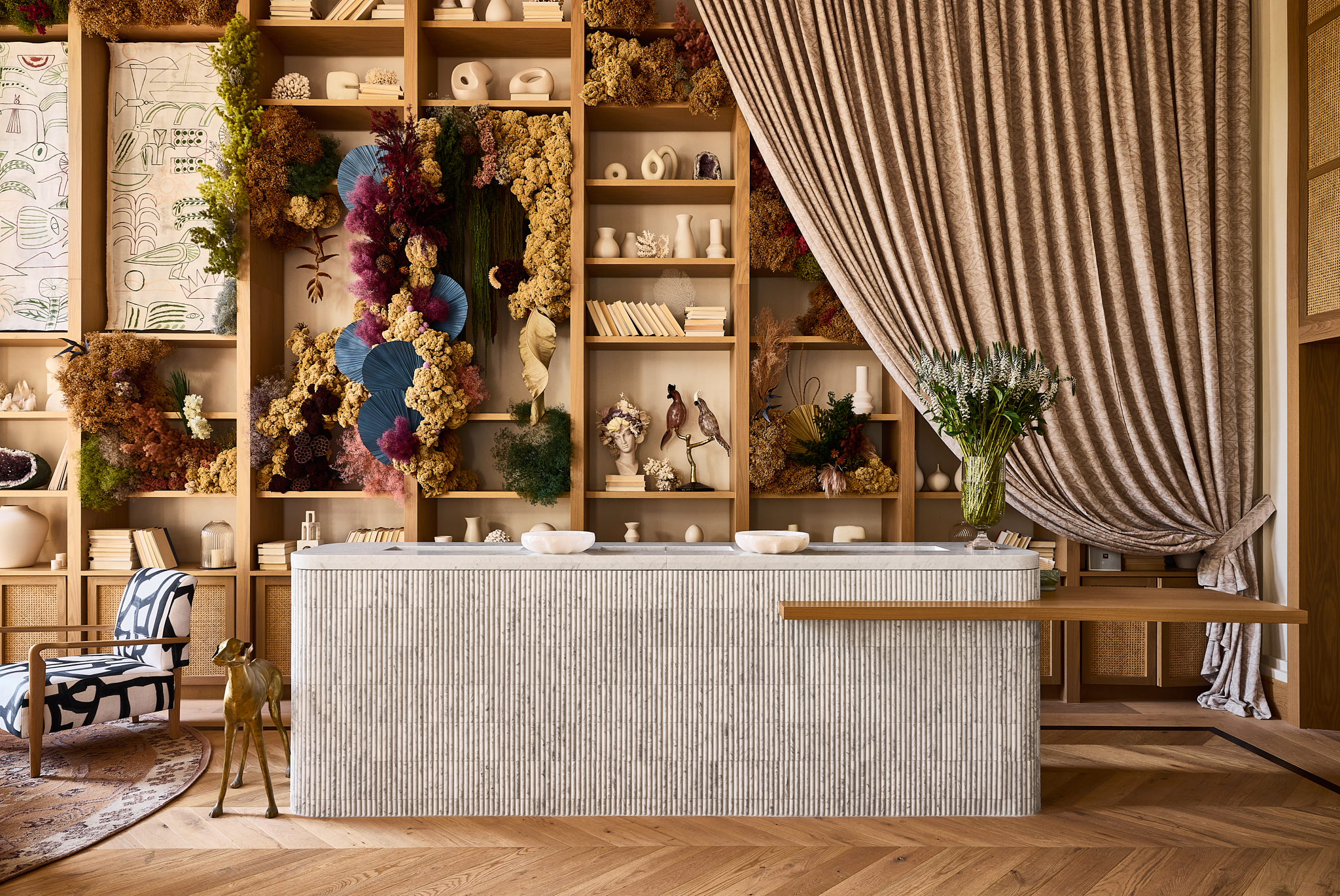
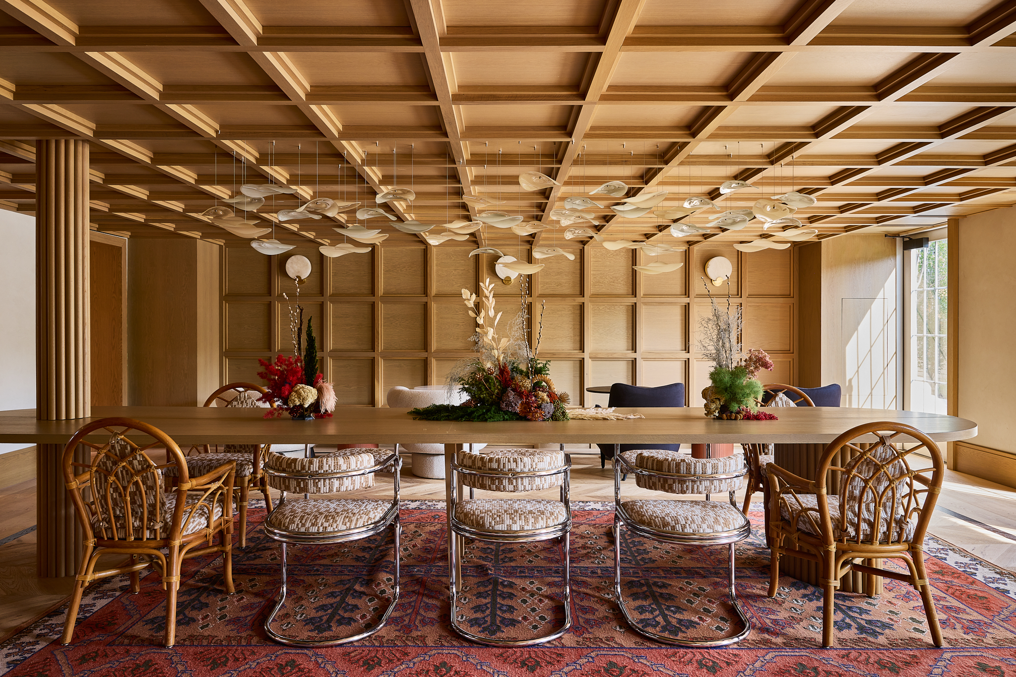
An adaptive reuse at Faraway Martha’s Vineyard presented the opportunity to celebrate this historic property while reimagining it through a unique conceptual lens. Originally known as the Kelly House, the 275-year-old building necessitated an adaptive reuse that would honor its roots while transitioning it into the 21st century in a sustainable way. Upon entering the lobby, guests tread onto chevron wood floors which, despite their recent addition, had been aged in collaboration with MADERA to appear as if remnants of the original structure. Designed as an ode to the classical New England library, the lobby space has a unique sense of history. Blending the Georgian architecture characteristic of the 19th century – (when the Kelley House first came into being) with the midcentury decorative style of our muses (James Taylor and Carly Simon) created a distinct, almost paradoxical feeling of timelessness. The eclecticism of the main lobby space carries into the smaller study space beyond the check-in area. Embracing the room’s low ceilings, we devised an all-over wood box panel design that evokes quintessential New England.

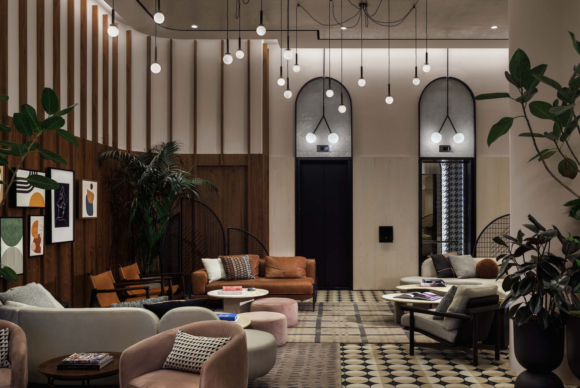
The concept for the New Motto Times Square – a towering Hilton property in the heart of New York City – compares and contrasts the 1920s and 2020s design that defines one of the world’s most iconic intersections. Looking past the flashy digital screens to the neighborhood’s rich theatrical history and Art Deco detailing, the team at Workshop/APD set out to create a vibrant but restful space for guests to escape Times Square’s sensory overload. The result is a peaceful oasis that offers visitors unprecedented access to the city’s busiest junction. Guests can relax and recharge at the first floor Motto Commons- a coffee and wine bar that blurs the line between hotel lobby and urban hot spot, as well as a 3-meal restaurant. Upper floors feature chic city sized guestrooms – each featuring connecting doors to offer travelers the option of extra space. Guest rooms pay subtle homage to the city with custom headboards that mimic the iconic skyline, while celebratory fabrics take cues from the ticker-tape parades of Times Square past
Looking back at the architectural history of the world’s busiest pedestrian intersection – the dimension, the rhythm and the honest materials – we set out to design an experience that brought the best of contemporary architecture and design and the glamour of its 1920s theatrical detailing together. The result is an exceptionally inviting, modern sanctuary that envelops guests and allows them to rest and recharge before they set back out to experience the sights and sounds of Times Square.
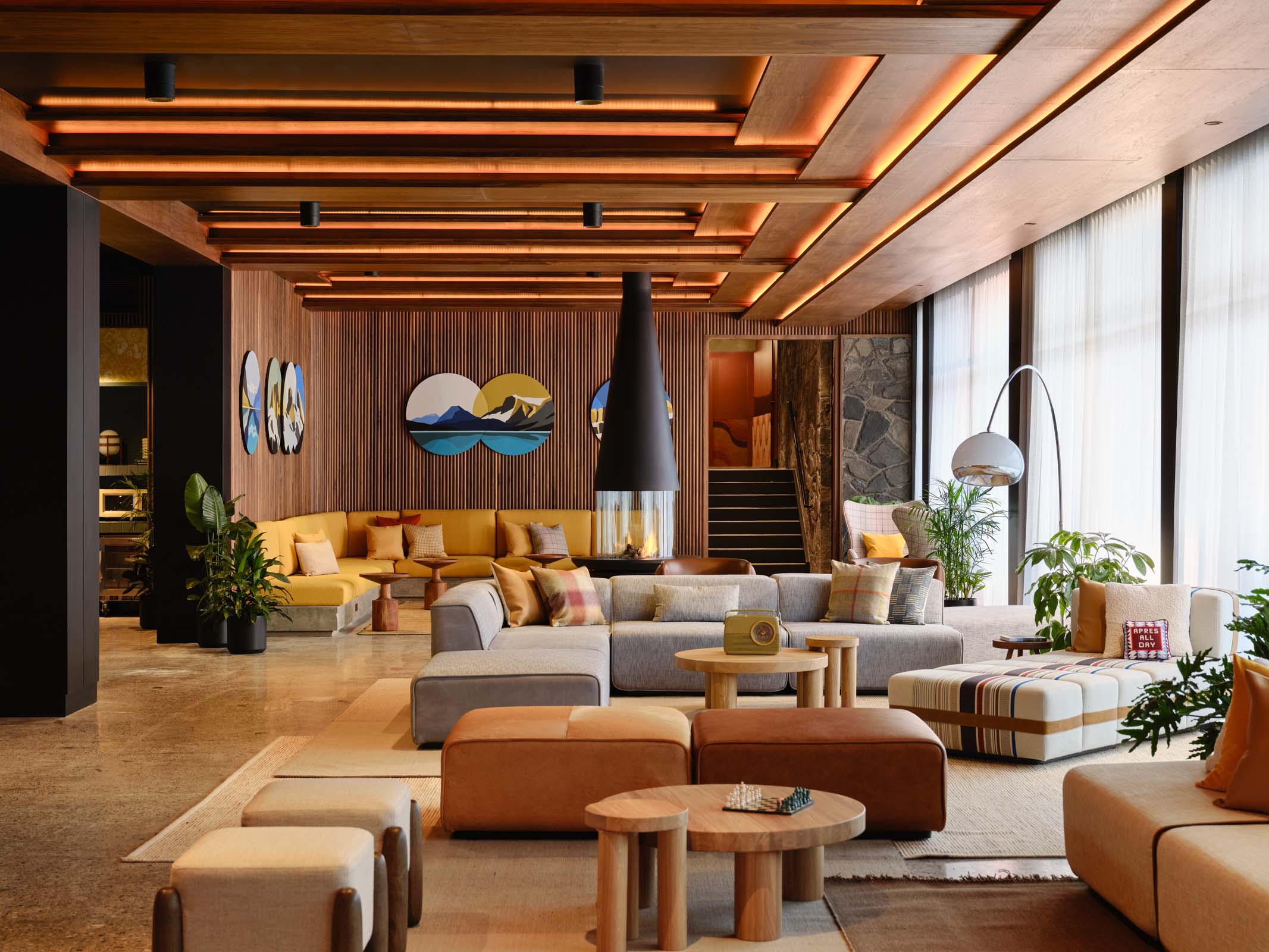
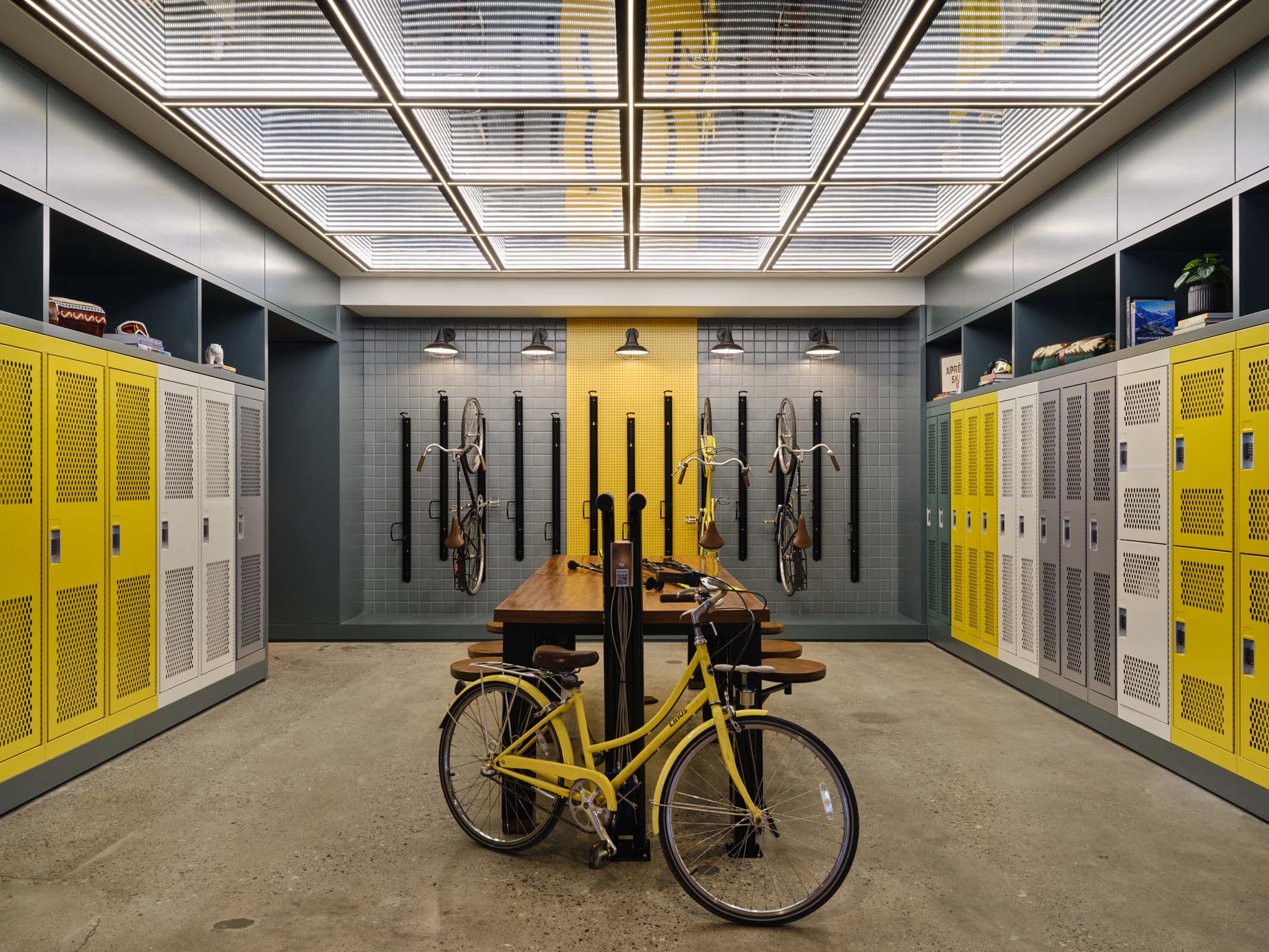
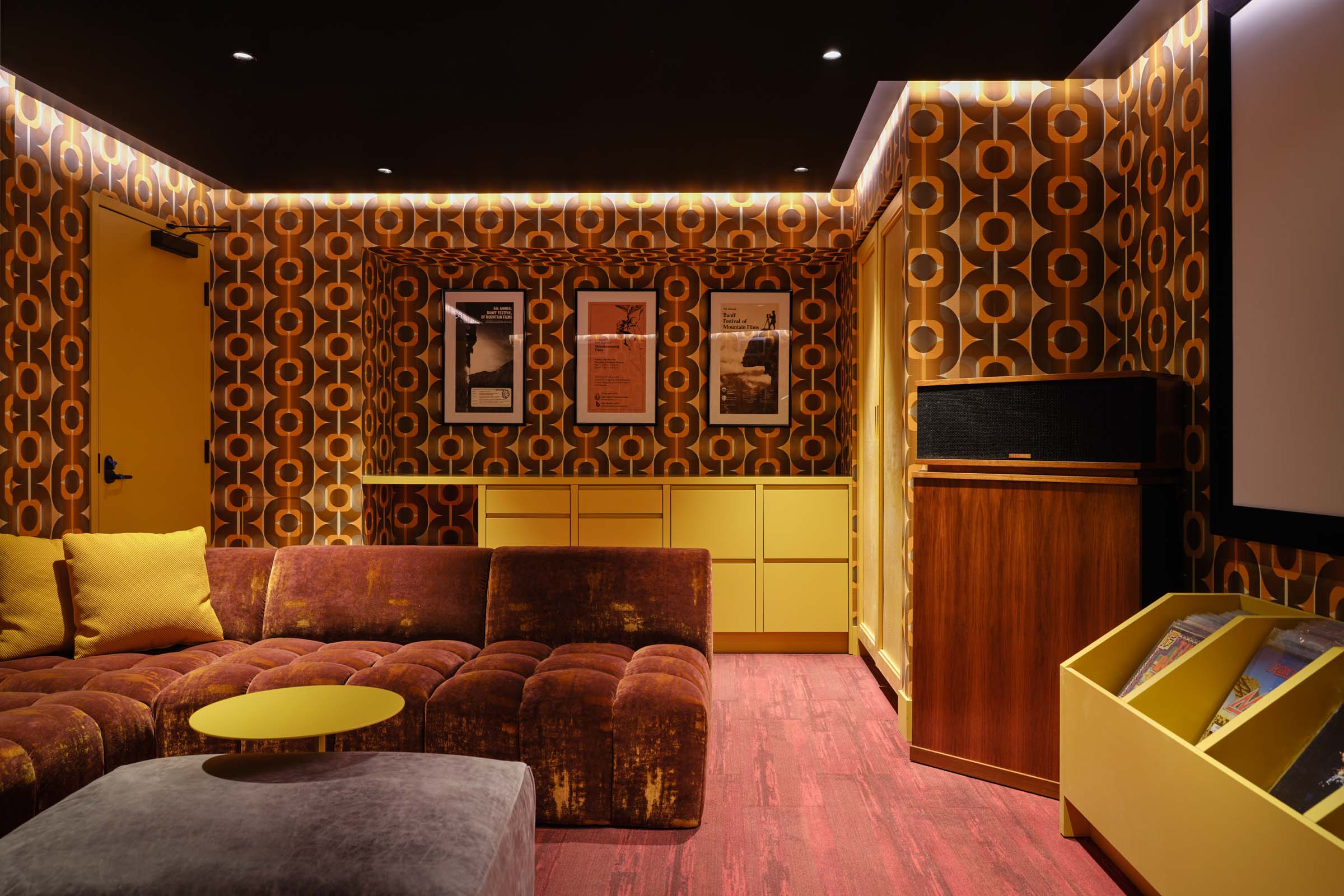
For Moxy Banff, the brand’s first Canadian outpost, the team at Workshop/APD explored the rich history and culture of Banff, a remote ski town in the Rocky Mountains steeped in natural beauty. An adaptive reuse of the former Voyager Inn (fondly known locally as “The Voy”), this hotel renovation is an homage to the building’s unique mid-century design, with vibrant, modern updates characteristic of the Moxy brand.
Bringing in elements from Banff’s past and present, the lobby transports guests to a playful, retro ski lodge inspired by the building’s origins. We played into the 1970s roots with deep red and russet tones, color blocking, psychedelic patterns, and warm globe lighting that invites guests into the space. At the same time, the ski lodge vibe is never lost; a modern fireplace anchors the lobby, while a custom ski chair hangs in the lower level for epic photo ops. Guest rooms embody the cozy cabin feeling with plaid wallcoverings, gear storage, and tufted leather headboards.
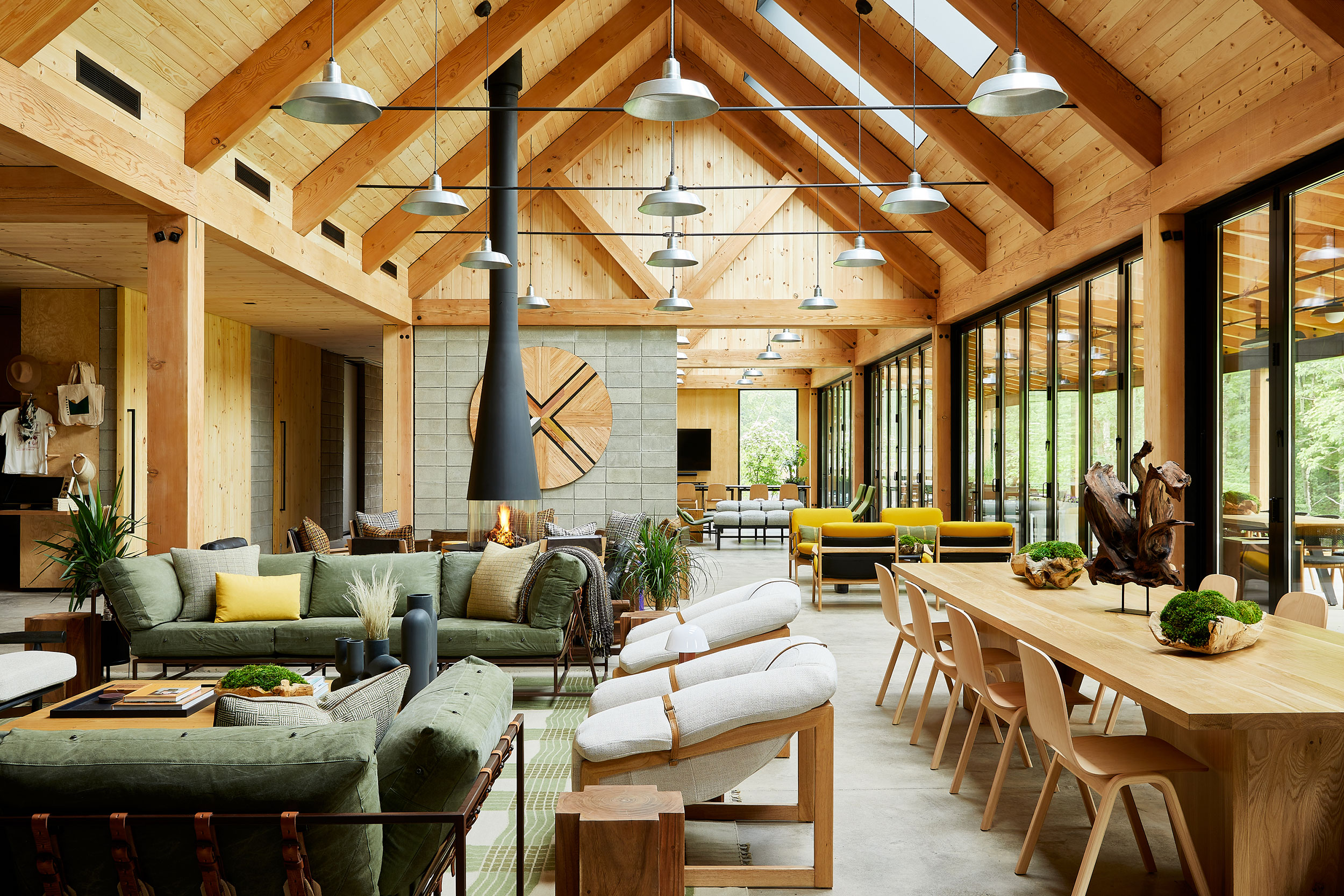
In Saugerties, Workshop/APD drew inspiration from traditional agrarian architecture and the rich local music culture to create a one-of-a-kind Catskills clubhouse for Autocamp. The modern barn structure is a composition of two gabled masses with exposed post-and beam interiors, creating a rustic gathering place that’s intrinsically tied to the community’s roots but with a hip, modern twist. Eclectic, vintage inspired décor and bold local art were also chosen to spotlight the site’s unique history.
Inspired by the booming agricultural industry in Upstate New York that goes back centuries, we designed the clubhouse to embody something between a livestock barn and a longhouse. Large windows, full-height French doors and covered patios all emphasize a connection to the outdoors.
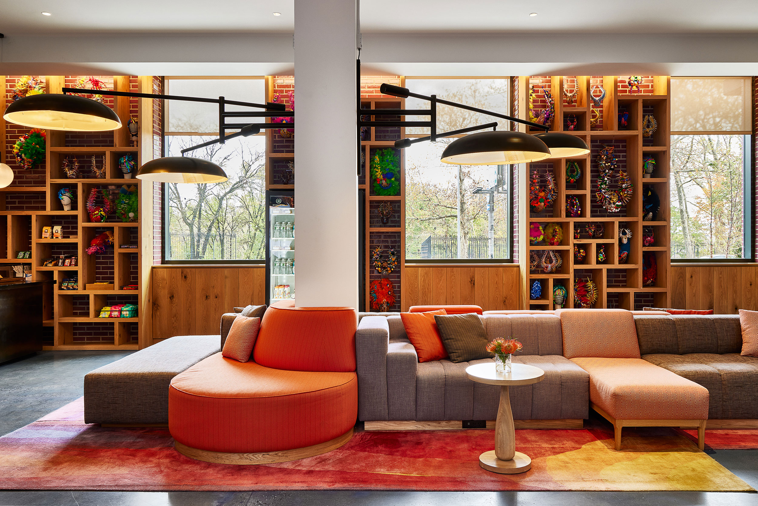
As Workshop/APD developed the design narrative for this micro-unit hotel in Washington Heights, we began by exploring the neighborhood. We interviewed local residents, who described the area as “a neighborhood in motion.” Our team discovered elements from within the urban landscape such as color, texture, street art, and existing architecture and then wove those elements together to create spaces that felt interesting and surprising, but still belonged to Washington Heights.
In an effort to mirror the neighborhood’s varied historic nature, the lobby design incorporated materials with character and backstory, including reclaimed wood, patinated metal, and overpainted brick. Soft seating was inspired by found pieces, re-envisioned into new modular sofas. Local artisans were commissioned to create indoor street art in public areas- an urban approach to bringing the outdoors in. The guest rooms were outfitted with materials visible in Dominican heritage, such as cement tiles and woven rugs & throws. The furniture was designed for small spaces, including a folding table that hangs on the wall and a bench that serves as both seating and storage.
COMING SOON: LE DEPOT & UNION PATISSERIE
Two new establishments from Chef Galen Zamarra – Le Depot and Union Patisserie – in Park City, Utah, take design and branding inspiration from the mountain town’s rich history. Constructed at the height of train travel in the American West, the depot building provided the perfect starting point for our place-based design scheme. The brasserie interiors contain instances of locomotive-inspired joinery and rich boiserie, while the color palette comes from both the cuisine and the mountain surroundings.

